X-Y charts allow the relationship between two attributes for a set of records to be examined. You create an X-Y chart by selecting the records of interest and then either specifying the attributes you want to plot, or by selecting a report template that specifies the information to be plotted. Report templates are managed by your GRANTA MI administrator.
 X-Y Chart.
The maximum number of records in a report is a user option and can be altered via Settings>Options.
To see which record a particularly interesting bubble corresponds to, click on the bubble: in the legend, the corresponding record is brought to the top of the list. Click to view an example
To see which bubble a particularly interesting record corresponds to, click on the colored line in the legend: in the chart, the corresponding bubble is highlighted. Click to view an example
Click Modify Chart in the toolbar at the top of the page to return to the Chart Properties page and modify the chart axis settings.
Click Tools > Change parameters to modify any parameters associated with the chart data.
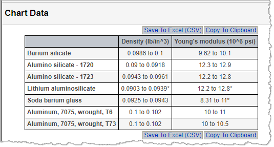
Click the View The Data command below the chart to view the underlying chart data in a table. The data in the table view can be copied to the clipboard or saved as a CSV file. To return to the chart view, on the View menu, click Chart.

You can copy a chart and paste the image into a document, presentation, or spreadsheet. Note that you may need to use Paste Special in your target document, depending on your browser.
If the current database contains two or more unit system, you can select the unit system used to display data values in the chart: at the top of the page, click Units and choose the unit system you want to use.