Comparison Charts
About
comparison charts
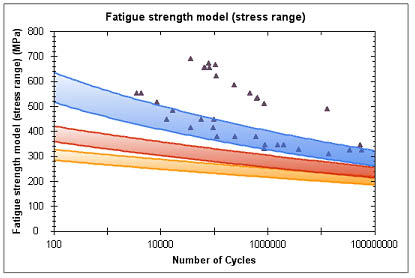
Comparison Charts allow you to compare combinations of curves and scatter
points for records from any part of the database. For example, you could
plot raw test data onto a design curve generated from a materials model
to verify the fit between the data and the model. A new set of raw data
can then easily be added to the chart to detect any changes in scatter
or distribution.

To ensure that you can only compare data which is appropriate, the units
and parameters of the functional attributes to be compared must be the
same. For example, this allows stress-strain curves from multiple database
tables to be compared, even if the attributes have different names.
If functional attributes in different tables share the same unit for
the y-axis, and the same parameter name and unit for the x-axis, then
they can be compared. Note that for units, the symbol is used for comparison.
Also, both unit symbol and parameter name comparison is case-sensitive.
For example, if you want to compare a stress-strain curve in your own
custom database, to one in a Granta data product, such as MMPDS, then
you need to ensure that the stress-strain attribute conforms to the following
convention:
- y-axis: Unit = MPa or ksi
- x-axis: Parameter name = Strain, Unit = % strain
To generate a comparison chart, you first select one or more functional
data charts of interest, then, optionally, select the data points to overlay
the chart.
Once a comparison chart has been created, it remains in place for the
session, unless replaced.
Generating
comparison charts 
Selecting the functional data attributes of interest can be done from
the datasheet or from the Reports
page.
To generate a comparison chart from a datasheet:
- Underneath the functional chart of interest, click Add
to Comparison Chart.
- Select New Chart for the
first chart added for comparison.
- To add further charts, browse to the datasheet and click Add to Comparison Chart, selecting
Add to Existing when prompted.
To generate a comparison chart from the Reports page:
- Click Reports on the toolbar.
- The Record List shows the
currently-selected records. Add or delete
records from the list, as required, then click
 Comparison Chart.
- If a comparison chart already exists, you can add the selected
records to the existing chart or replace it with a new chart. Select
the option you want and then click OK.
- On the Add data page, under
Add curves, select the functional
attribute of interest. This is plotted on the y-axis of the chart
If you have an existing chart, only attributes which have compatible
units and parameters will be listed.
- Select the parameter for the x-axis of the chart.
- Click Add Series to
generate the new chart/add data to the existing chart. (A set
of records is considered a 'series'.)
Overlaying
a comparison chart with numeric data 
You can select a pair of attributes from your chosen records to scatter
on an existing comparison chart. The data points must have units that
are compatible with the base chart.
Selecting the records to overlay is done from the Record List.
- Click Reports on the toolbar.
- Click
 Comparison
Chart.
- Select Add records to the existing
comparison chart and click OK.
- Under Add scatter points (X-Y
values), select the attributes of interest from the lists.
- The upper attribute is plotted on the y-axis of the comparison
chart; the lower attribute is plotted on the x-axis.
- Only those attributes in the records that are unit compatible
with the axis will be available.
- Click Add Series to
add the series data to the existing comparison chart.
Adding data from another
database
Comparison Charts allow you to compare curves and scatter points from
different databases, for example, to compare different sources of the
same data.
- In the first database, create a Comparison Chart of the functional
data you are interested in.
- In the second database, locate the record containing the
data you want to compare, and open its datasheet.
- On the datasheet, find the functional attribute corresponding to
the charted data, and click on Add
to Comparison Chart below the graph.
- Click Add to Existing.
- The new curve is added to your existing Comparison Chart.
Viewing
an existing comparison chart
- Click Reports on the toolbar.
- At the top of the Reports
page, click View Existing Comparison
Chart.
Copying a comparison
chart
You can copy a chart and paste it into a document, presentation, or
spreadsheet. The chart and legend must be copied/pasted separately and
note that you may need to use Paste Special
in your target document.
- On the Comparison Chart
page, click the Copy command
below the chart.
- Copy the image using your browser's Copy function, then paste it
into the target document.
- Copy the legend using your browser's copy function, then paste
it into the target document.
- Click Close.
Multi-valued point (MVP) data will be copied to the clipboard as a separate
table (one table per MVP attribute).
Changing
the chart units
If the current database contains two or more unit
systems, you can select the unit system used to display data values
in the chart: on the toolbar at the top of the page, click Units
and choose the unit system you want to use.
Formatting
charts
The visibility and color of lines and points in a chart can be easily
changed via the chart's legend.
To change the color of lines and points
In the second column of the legend, click on the color picker button
for a curve or series to open the Color
menu, and select the color you want. The chart will update immediately.
To show/hide lines and points in the chart
In the first column of the legend, clear the check box for a curve or
series to hide its line or points from the chart; select the check box
to show it again.
To show/hide values in the chart
Use the drop down list at the top of each column in the Curve Data legend
to select a specific value to show on the chart, or to show all values.
To format series data
Additional formatting options for series data are available via the
Edit Series page: click Edit in the series legend.
To format the data points:
- Select which records in the series to edit. Selecting the top item
enables selection or de-selection of all records.
- Click Hide to hide the
selected records on the chart. The 'Visible' column will update.
- Click Display to show the
selected records on the chart. The 'Visible' column will update.
- Click Delete to remove
the selected records from the chart. The table will update.
To add these series again, you must return to the record list.
- Click Back to Chart.
To change the symbol for the series (or to split a series) :
- Select which records in the series to edit. Selecting the top item
enables selection or de-selection of all records.
- Click Change symbol and
choose the desired symbol.
- Click Cancel to close the
window without making a choice.
Note: If you only change the
symbol for some of the records, those records become a new series.
To change the name of the series :
- Click Edit next to the
series name at the top of the page.
- Type the new name and click Save.
To view more data columns:
- Click View More Data.
- Click on an attribute name to select it. You are returned to the
page, with the record values for the selected attribute visible in
a new column.
- Click Back to Chart to
return to the comparison chart.


 Comparison Chart.
 Comparison
Chart.